This visualisation of temperatures in Lancashire (UK) shows annual mean data from 1754-2015. The long-term warming trend is clear, with variability from year to year, and some temporary cooler periods due to large volcanic eruptions. The average of the 19th century (black line) separates the warm and cold colours.
Continue reading Lancashire temperatures, visualised
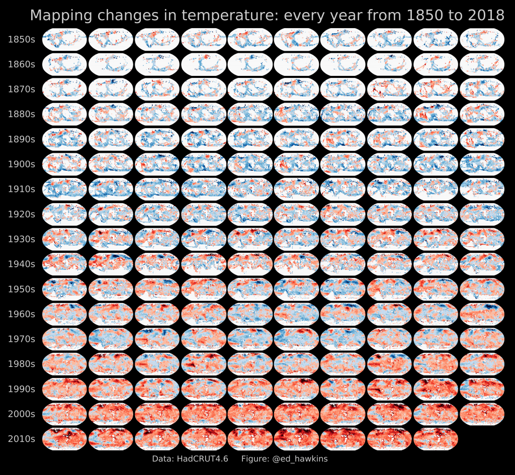
Image Archives
Mapping global temperature change
[Updated: 17th September 2019]
The visualisation technique of ‘small multiples’ is often used to communicate a simple message. The above example shows maps of temperature change from 1850-2017 – the overall warming trend is obvious even though the details are fuzzy. Continue reading Mapping global temperature change
Olympic spiral
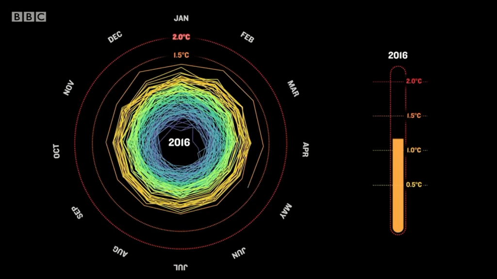
If you watched the opening ceremony of the Olympics, you would have noticed a segment discussing climate change, accompanied by graphics of CO2 emissions, Arctic sea ice melting, sea level rise and a somewhat familiar spiral representation of rising global temperatures (above), a version of which you may have seen somewhere before.
Needless to say, I was rather shocked while watching!
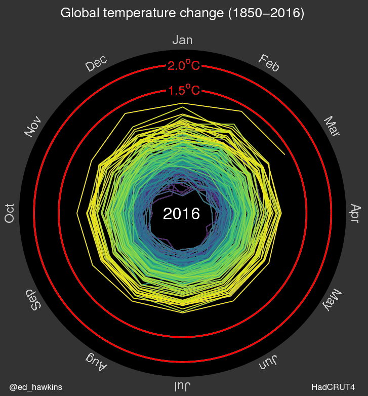
Spiralling global temperatures
Updates to this animation are now available
Continue reading Spiralling global temperatures
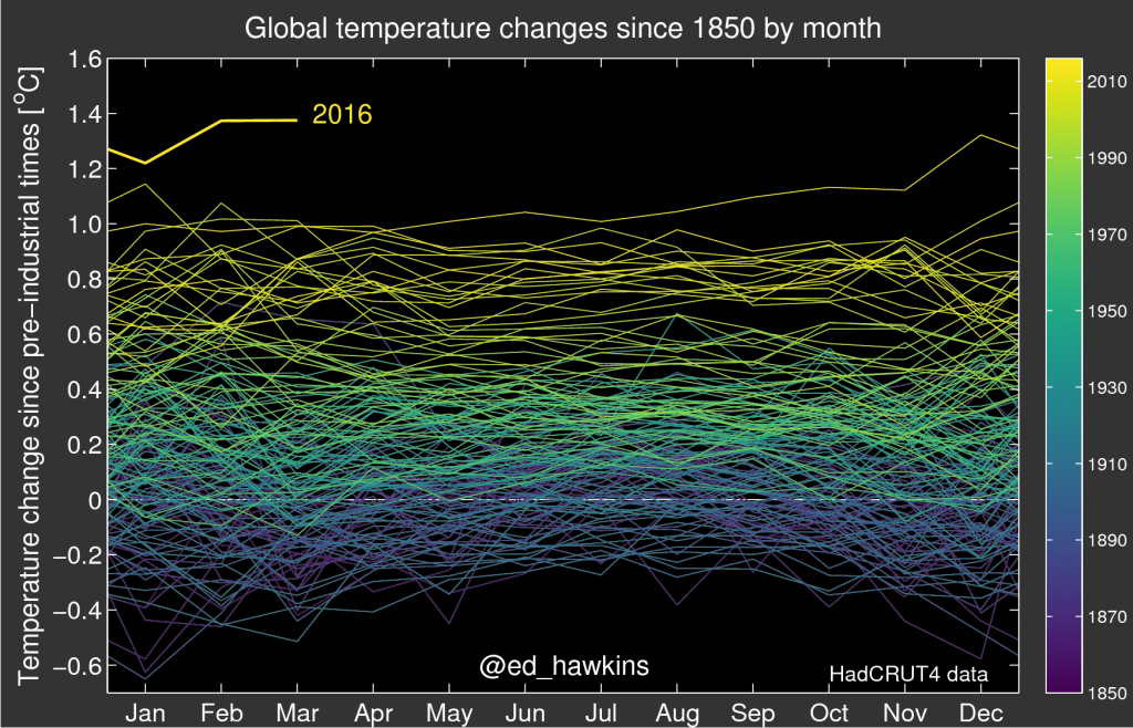
Global temperature changes since 1850
New viridis colour scale
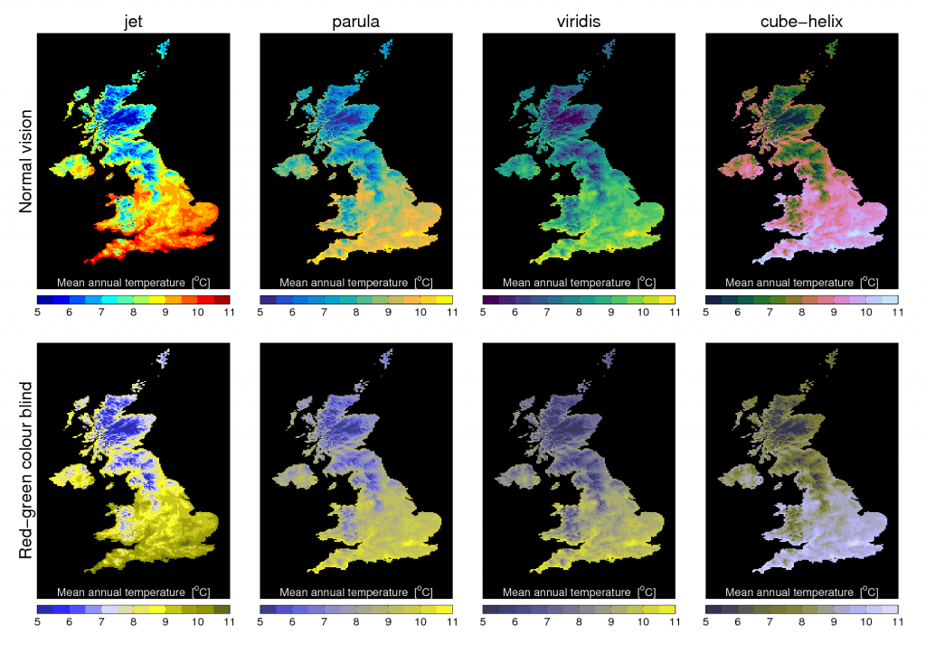
Below is a simple example of using different colour maps to show the same UK mean temperature data for both normal vision and a simulation of colour blindness.
Viridis is a new colour map developed for Python (MATLAB code here) with lots of nice features, including removal of artificial perceptual boundaries which jet suffers from.
Which do you prefer?
[This post continues our #endrainbow campaign to reduce use of ‘rainbow’ colour scales like jet.]
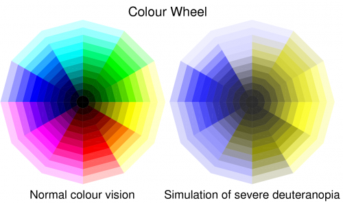
Reinventing the colour wheel
Between 5-10% of men and around 0.5% of women are affected by various forms of colour blindness. The most common form is deuteranopia, for which distinguishing between red and green is particularly challenging. This has been pointed out many times before, but it may be worth remembering next time you make a figure or visualisation: ‘red and green should never be seen’.
[Part of the #endrainbow campaign.]