The warming that has occurred over the past 160 years has not been the same everywhere. Certain regions, such as the Arctic, have warmed far more than the Southern Ocean for example. How well do our climate models represent these differences? Continue reading Zonal mean temperature change in observations & models
Spiral birthday
Just over a year ago I received an email from a colleague I had never met. Jan Fuglestvedt asked whether I had ever made a spiral version of my global temperature graphics. He ended by suggesting that this was ‘just a (crazy) thought’.
But, it was a Friday afternoon – what else was I going to do? Continue reading Spiral birthday
Choose colour scales carefully
When designing scientific graphics, one key choice is about which colour scale to use (something discussed in several previous posts). The animated graphic below is a simulation of how an image would look to someone who is colour blind (a few percent of men). Continue reading Choose colour scales carefully
Global temperature change as polka-dots
Inspired by National Geographic’s climate change evidence graphics, I made my own global temperature polka-dot visualisations.
In the spirit of experimentation, here are three types, successively getting more complicated. After comments from several people I have made both portrait & landscape versions. I would be interested to know which works best for you. Continue reading Global temperature change as polka-dots
Frost fairs and the Little Ice Age
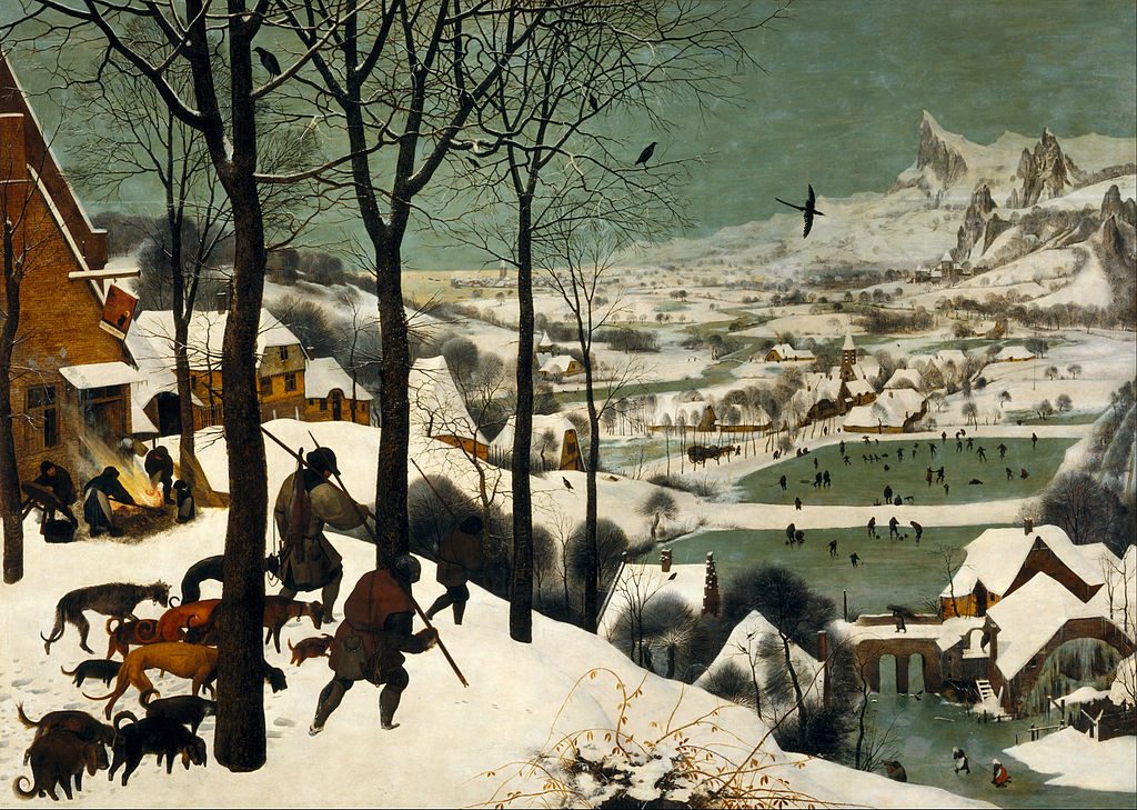
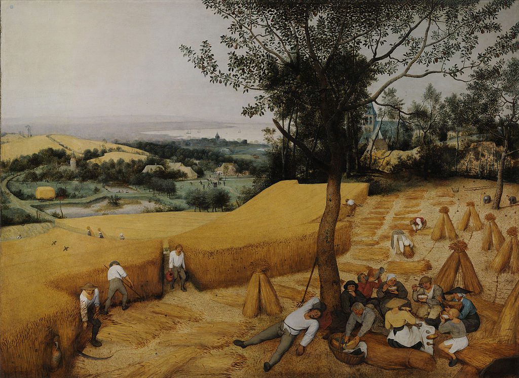
The term ‘Little Ice Age’ refers to a period of cooler temperatures between around 1400 and 1850, although a range of dates are used. This climate feature has been inferred from various types of direct and indirect evidence, but it is still not clear how widespread these cooler temperatures were.
A new article by Lockwood et al explores some of the commonly used indirect evidence such as paintings and the occurrence of ‘frost fairs’ on the Thames. We also address the common assumption that the cooler temperatures were solely due to a reduction in solar activity (the Spörer and Maunder minima). Although this assumption is almost certainly wrong, the two features are sometimes considered to be synonymous.
Letter to Lamar Smith
The Committee on Science, Space & Technology of the US House of Representatives conducts regular evidence hearings on various science topics. On Wednesday 29th March, there is a hearing on “Climate science: assumptions, policy implications, and the scientific method”. The following letter, summarising the scientific findings of Fyfe et al. (2016) and Karl et al. (2015), has been submitted as evidence to this hearing.
The broader context is that the Committee Chairman, Mr. Lamar Smith, has previously discussed the findings of Fyfe et al. (of which I was a co-author), claiming: “A new peer-reviewed study, published in the journal Nature, confirms the halt in global warming”. This statement is incorrect, and motivated the clarification on what Fyfe et al. actually says.
Coral reef bleaching
Animating global sea ice changes
Scientists can’t do everything by themselves. We need to engage the millions of citizens who are passionate about knowledge to help solve scientific mysteries and improve our understanding of the world around us.
There are many ways that anyone with a computer can help – volunteer to rescue old weather data or loan your computer’s CPU to simulate the climate, for example.
Those with more technical knowledge might also contribute by communicating climate change in novel ways. Recently, Kevin Pluck (a software engineer) created a global sea ice spiral which gained widespread attention on social media – here he tells Climate Lab Book how he did it. Continue reading Animating global sea ice changes


