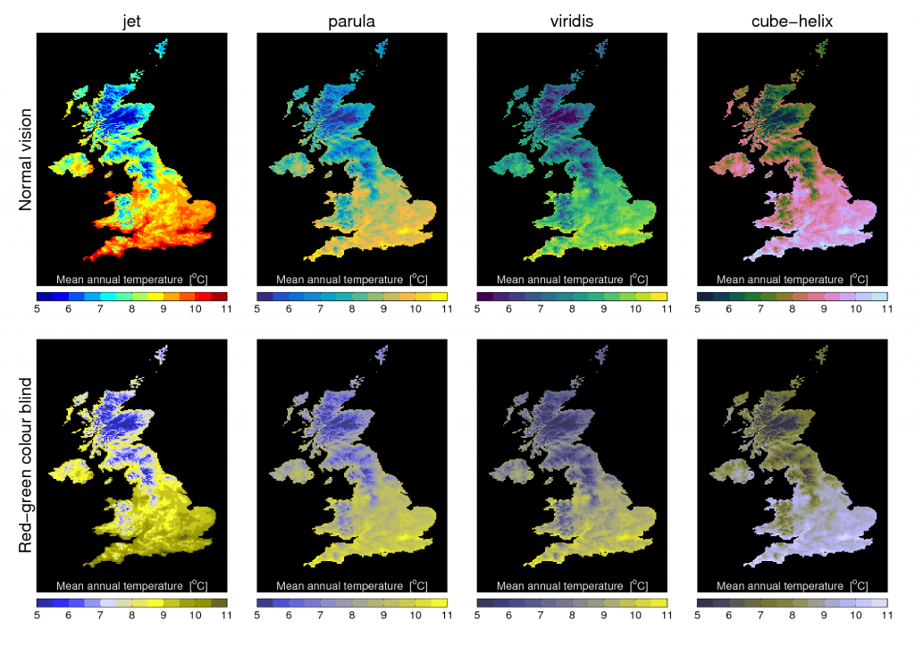
Below is a simple example of using different colour maps to show the same UK mean temperature data for both normal vision and a simulation of colour blindness.
Viridis is a new colour map developed for Python (MATLAB code here) with lots of nice features, including removal of artificial perceptual boundaries which jet suffers from.
Which do you prefer?

[This post continues our #endrainbow campaign to reduce use of ‘rainbow’ colour scales like jet.]