Previous posts have described some initial analysis of the data from the Old Weather project, which is using public volunteers to digitise new historical weather observations from Royal Navy ships during World War 1. The good news is that these observations will improve our knowledge of the atmospheric circulation.
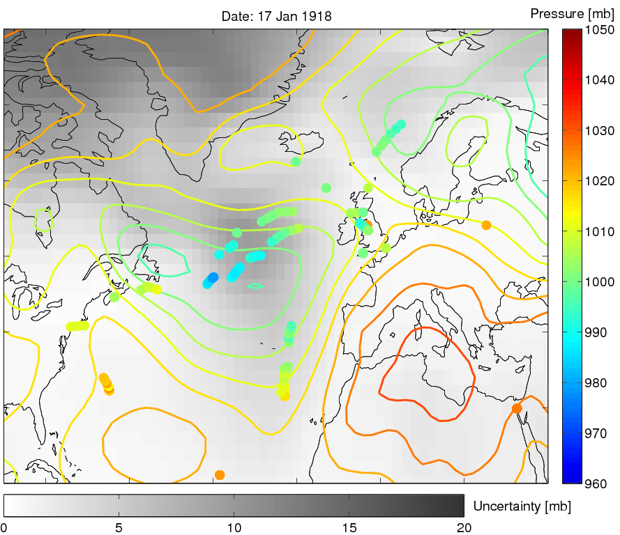
The coloured lines in the figure below are our current ‘best guess’ of what the sea level pressure looked like on this particular day (17th Jan 1918, from the 20th Century Reanalysis). The circles are the new data from Old Weather ships (again, the colours are the measured pressure). What is particularly interesting is the grey scale – the darker the grey, the more uncertain the estimate of the sea level pressure. As you can see, there are many new Old Weather measurements in the North Atlantic where the uncertainty is rather high. These measurements will, in time, be included into our ‘better guess’ for the sea level pressure! This is just one good example, but there are many others.
