In a previous post I discussed the Old Weather project which is using volunteers to transcribe the hand-written weather data from Royal Navy ships logs in the World War 1 period. The good news is the first 243 ships have been completed (providing data scattered throughout the period 1914-1923), and some simple analysis shows whether this data can help reconstruct past Atlantic atmospheric variability.
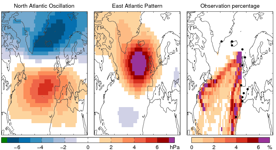
The North Atlantic Oscillation (NAO) is the leading pattern (Fig. 1a) of variability in winter (DJF) mean sea level pressure (MSLP) in the Atlantic sector, and its phase and magnitude can significantly affect European climate (e.g. winter 2010 had a very negative phase, producing very cold weather over Europe). The second most important mode of variability is the East Atlantic Pattern (Fig. 1b).
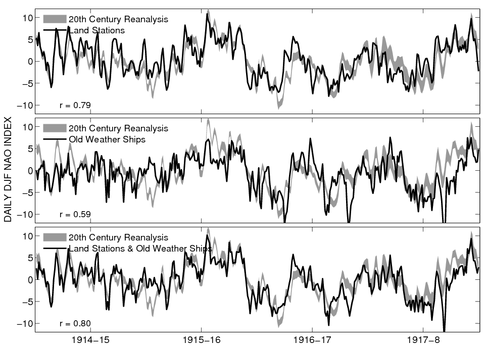
Here we focus on 1914-1918 and winter MSLP data only. Data from 12 existing land stations (black dots in Fig. 1c), and new Old Weather ships (distribution in Fig. 1c) is used to reconstruct the daily temporal variability of the NAO (Fig. 2) and EAP (not shown), and compared with an estimate from the 20th Century Reanalysis (grey shading), which uses a weather forecast model to fill in the gaps between observations. Not all the ships have data for the entire period considered – sometimes there are just a few data points each day, and sometimes up to 35 ships reporting on a particular day.
The land stations perform well at reconstructing the NAO daily variability, probably better than the available ships overall. Nevertheless, the ship data is improving the reconstruction from instrumental records (albeit slightly), and this bodes well, especially considering the large caveat that the Old Weather ship data is very provisional and has not yet been fully quality controlled. However for the 1917-18 winter, more ship data is available (around 30 reporting ships on average, compared to 10 for other years) and the ship reconstruction alone is closer to the Reanalysis than the land data (not shown).


r value.
I’m being dense. What is the horizontal axis on Fig. 2? It seems to be time, continuous over 4 years, but the caption says that it is a winter (DJF) reconstruction, so I would expect to see 4 separate (discontinuous) charts. If it is continuous time, what moments in time do the ticks mark? The turn of each year?
Not dense Nick! It is time, but just for DJF, without a break between Feb and Dec – I should add a break to make it clearer. The tick marks represent the middle of each DJF, so Jan 15 for each of the seasons.
Thanks,
Ed.
I wondered about that, and looked for discontinuities in the data lines, decided they might be there but then again it could just be noise. Thanks for clarifying.