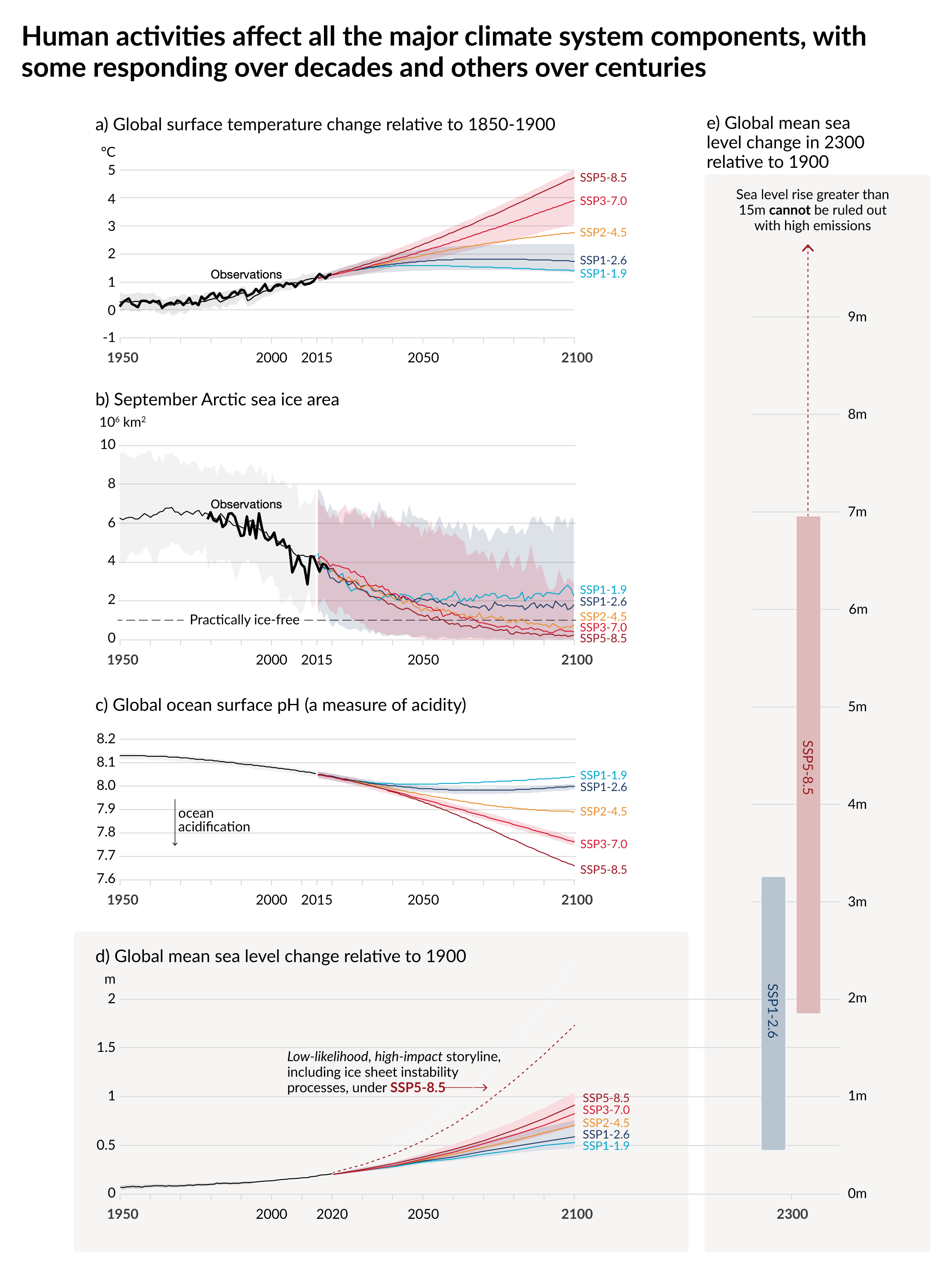
The figures in the IPCC AR6 WGI SPM are a huge improvement over previous reports. However, one minor quibble is with the lack of observations shown. This brief post makes a figure available which is based on IPCC AR6 WGI SPM Figure 8, but with some observations added to show how global surface temperature and Arctic sea ice area have varied, compared to the model simulations. In my view this is a scientific improvement over the original version.
This is based on the original with an added transparent overlay if anyone would like to animate these aspects. Note that the historical period in the sea level panel is already observations rather than the model simulations as shown in the other panels.
Note: this graphic uses the datasets analysed in AR6 but is not an official IPCC product. The time series are constructed in Chapter 2 (global temperature) and Chapter 9 (sea ice area) as the average of several datasets. An observed estimate for global ocean surface pH does not yet exist.

Hi Ed,
Thanks for the additional information on Artic sea ice extent.
Have you noticed the decline in sea ice extent has paused since 2005.
There has been a recovery since the low of 2012.
August sea ice is currently above the 2010’s average.
September sea ice is forecast to show a recovery on 2020.
Do the IPCC forecasts take any account of the AMO?
Will the falling AMO not moderate any warmig from CO2?
Hi Ed,
Thanks for the additional information on Artic sea ice extent.
Have you noticed the decline in sea ice extent has paused since 2005.
There has been a recovery since the low of 2012.
August sea ice is currently above the 2010’s average.
September sea ice is forecast to show a recovery on 2020.
Do the IPCC forecasts take any account of the AMO?
Will the falling AMO not moderate any warming from CO2?