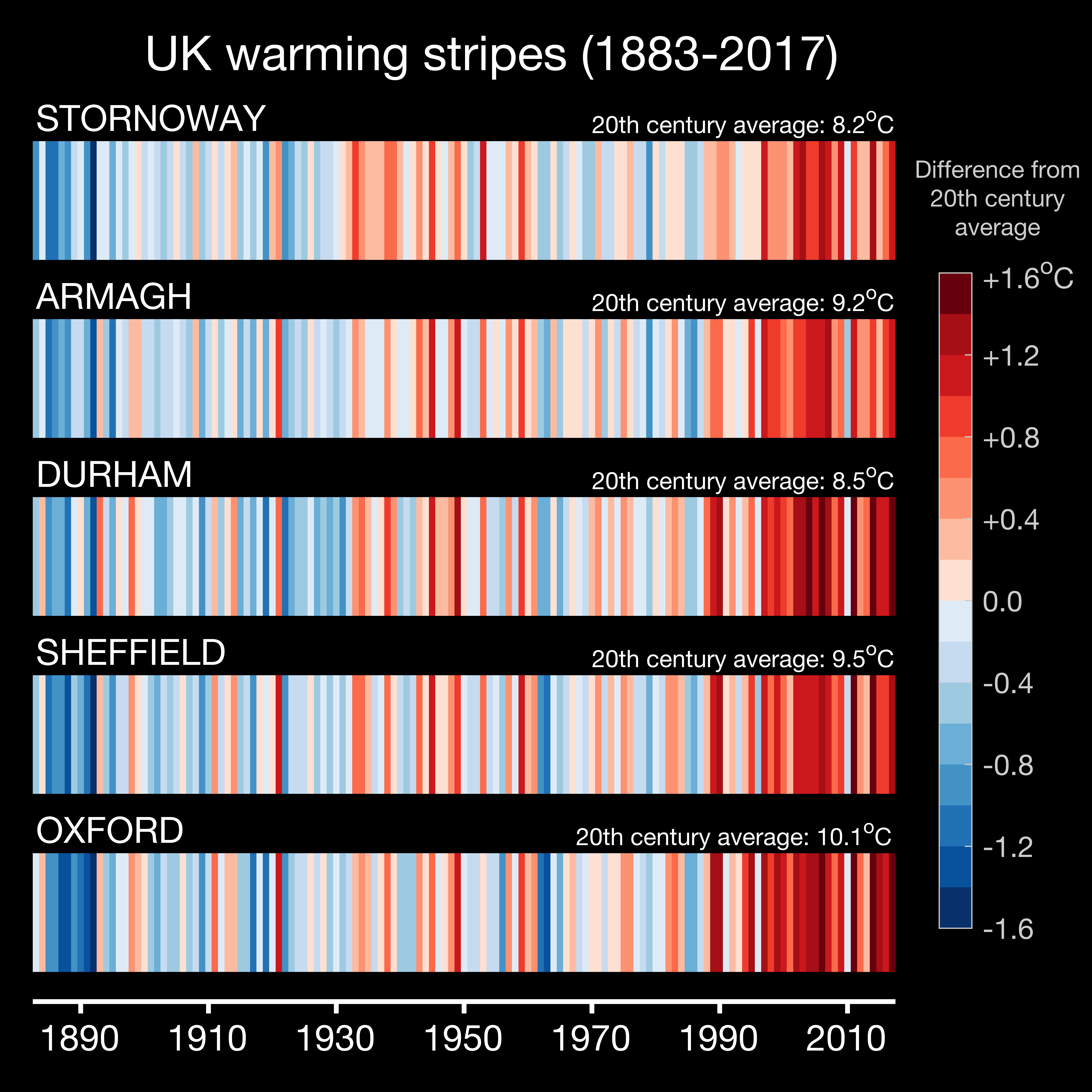
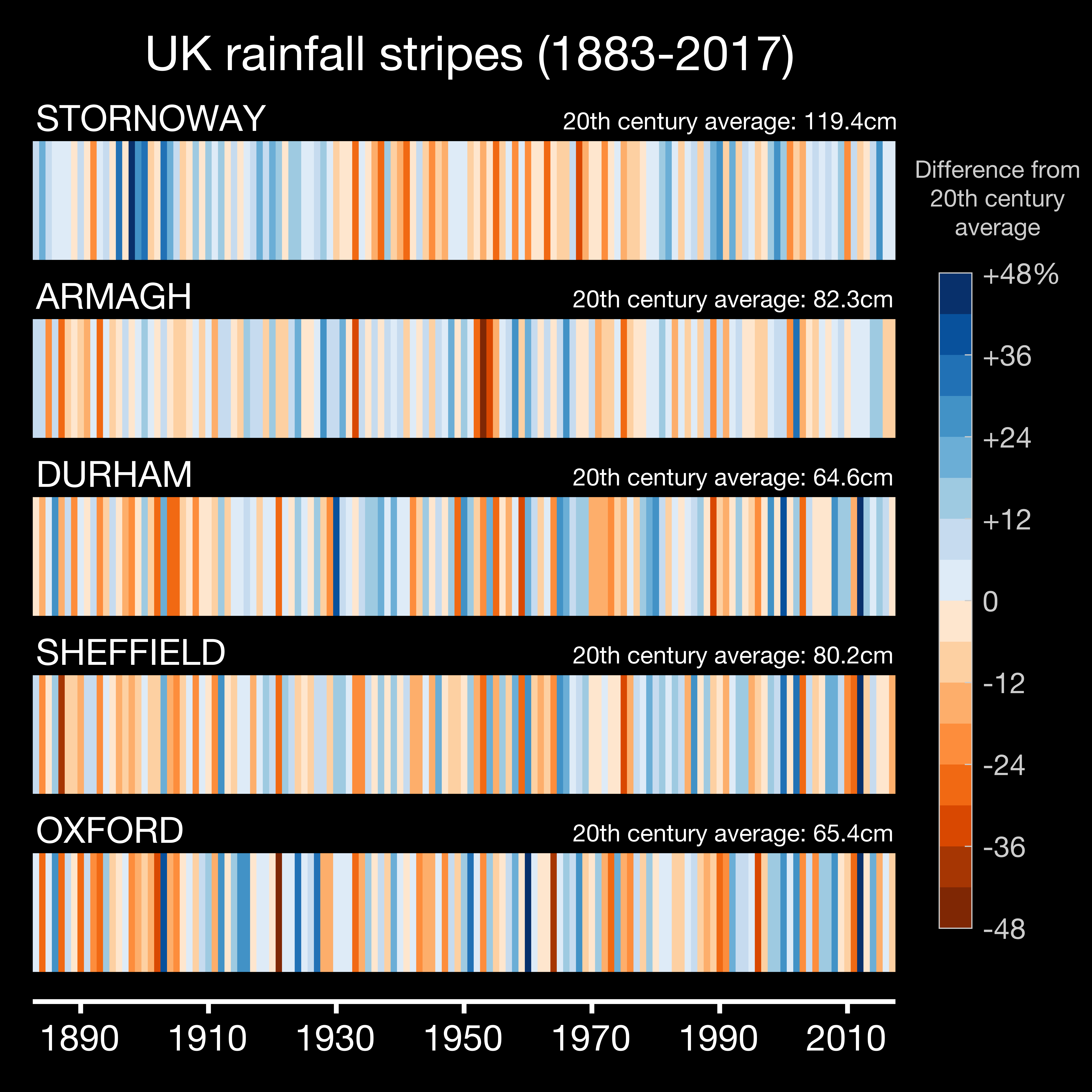
Following the ‘warming stripes‘ graphics for different locations around the world, this post focusses on the UK. The Met Office makes easily available long-running climate data from a small number of locations*. The visualisations below show the common changes in temperature and rainfall for the five longest climate monitoring stations in that set – Stornoway, Armagh, Durham, Sheffield & Oxford – which all have data for 1883-2017.
For temperature, the trends and variations are remarkably similar. Warmer and cooler years line up in the data from these independent weather stations spread across the country. This image paints a clear picture of the long-term warming in the UK – the total change has been just more than 1°C.
For rainfall, the overall trends are far smaller than for temperature and individual years can be very different across the UK. For example, 2012 was very wet for the three locations in England, but not for those in Scotland and Northern Ireland. Stornoway shows a multi-decadal wet-dry-wet pattern, presumably related to variations in the North Atlantic Oscillation. The other locations all show a relatively dry period before around 1910.
[*Note: there are far more locations where the climate has been monitored in the UK for long periods, but these are the most easily available.]


It is amazing to see the timeline of cities’ climate data. Individual cycles of drought and excessive rainfall are evident. Thank you for sharing!
Can I buy a pin with the climate stripes somewhere? Thanks