What will happen to the climate over the next decade? Two new analyses consider real climate predictions made in the past and of the future decade.
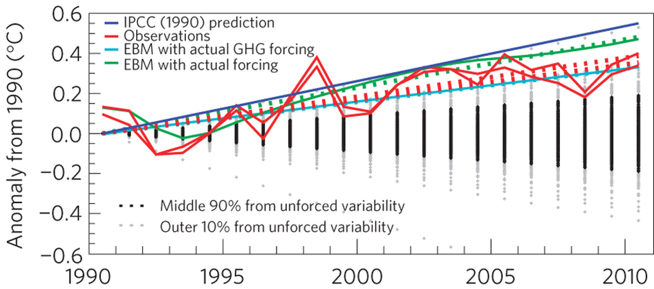
In 1990, the IPCC published its first assessment report. The predictions made have now been compared with the subsequent observations (Figure 1), and found to have been quite accurate. However, can we do better?
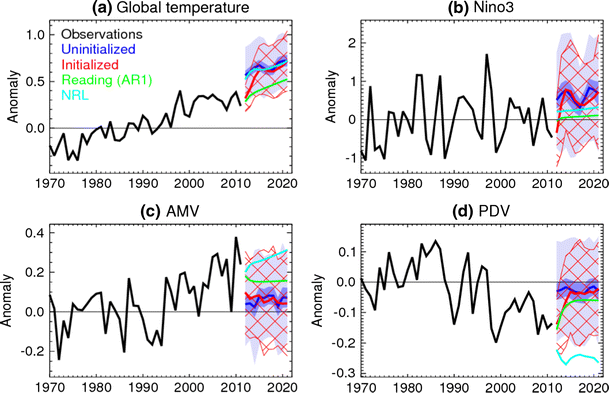
Now, various climate prediction centres have produced temperature forecasts for the coming decade, and have published the real-time predictions to enable verification. There are two types of prediction – termed ‘initialised’ and ‘uninitialised’ – and the difference is that the initialised predictions are designed to predict the natural climate fluctuations, as well as any forced trend, whereas the uninitialised predictions only attempt to predict the forced component. The new analysis finds that (and see Figure 2),
… initialized forecasts of globally averaged temperature are significantly cooler than uninitialized ones until 2015. However, in the absence of significant volcanic eruptions, global mean temperature is predicted to continue to rise. Assuming all ensemble members to be equally likely, the dynamical models predict at least a 50% chance of each year from 2013 onwards exceeding the current observed record.
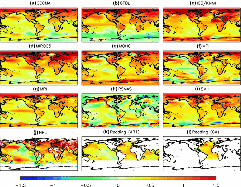
In addition, the maps of the warming (Figure 3) suggest that the Arctic will warm most, along with the land areas in general. Three of the predictions are based on empirical methods (NRL and two from Reading) and the rest use dynamical coupled climate models.
It is fair to say that these predictions are experimental, and the paper is very clear about this. But, there is a need to be open and transparent about the predictions so that we can learn from their successes and failures. For example, (i) the initialised predictions are very similar to the uninitialised predictions beyond a few years, suggesting quite a rapid warming, (ii) the RSMAS prediction is quite different from the others, (iii) NRL predict quite a strong PDV cooling.
Now, it is wait and see!


Frame, D., & Stone, D. (2012). Assessment of the first consensus prediction on climate change Nature Climate Change DOI: 10.1038/nclimate1763
Smith, D., Scaife, A., Boer, G., Caian, M., Doblas-Reyes, F., Guemas, V., Hawkins, E., Hazeleger, W., Hermanson, L., Ho, C., Ishii, M., Kharin, V., Kimoto, M., Kirtman, B., Lean, J., Matei, D., Merryfield, W., Müller, W., Pohlmann, H., Rosati, A., Wouters, B., & Wyser, K. (2012). Real-time multi-model decadal climate predictions Climate Dynamics DOI: 10.1007/s00382-012-1600-0
Ho, C., Hawkins, E., Shaffrey, L., & Underwood, F. (2012). Statistical decadal predictions for sea surface temperatures: a benchmark for dynamical GCM predictions Climate Dynamics DOI: 10.1007/s00382-012-1531-9
Hi Ed,
It’s me again.
I was trying to write some comment on your Mongolia temperatures post and I found myself looking at the seasonal trends (DJF, MAM, JJA, SON) for the same grid square for the contiguous record (1938-2008). These give a bit of a mixed picture not only do the trends differ between seasons but also between the history before the late 1990s and short stretch after. I was left to wonder whether the any of the dog-leg patterns produced were in any way unlikely by chance.
The trouble is I had gone fishing for patterns, I had decided only to use the contiguous history, I had chosen to look at seasonal averages, with a certain definition of seasons, I had chosen the year at which I think the pattern changes. Given all that input, all that additional information that I had added to the picutre, what if anything would constitute a test of significance?
If only I ad written out a document detailing in advance exactly how it would be treated prior to any sight of the data at all, before reading this page, perhaps some test could have been devised. What I needed was a pre-existing rulebook that covered the eventualities.
Attempts to evaluate the predictions in these new papers could suffer from the same problem.
I think it would be a good idea if we were to document an approach to deciding how to evaluate the various predictions for the ten years (2012-2021) before the first year of global temperature data is in.
I have my own ideas.
If the values can be considered to be medians a simple count of how many observations fall below each value and how many don’t fall below. This would enable each prediction to be judged for bias in the same simple way as a tossed coin. I would suggest that the normalized likelihood of the bias given the evidence shouldn’t drop the unbiased case, a 50:50 chance, e.g. bias parameter = 0.5, into either of the 5% tails.
I think that means that the splits shouldn’t be worse than (1:3) , (2:5), and (3:7) after 4, 7, and 10 years respectively.
I think that would be sufficient to discriminate between the upper group and your AR1 prediction, there is a lot of clear space between them after the first couple of years.
Others will have their own ideas but it would be nice if we could all choose to use the same methodology just for once and decide upon it now.
I am not sure if anyone will see my point that unless this is a game played to a fixed rulebook it may show very little.
For instance, unless it is decided in advance what to do about volcanism should there be a major event, the whole thing is rendered arbitary. E.G. evidence about volcanic plumes that is not currently available may be used in the analysis of a prediction already sealed, which would make no sense to me at all.
I suspect there will be a clear winner given a suitable test, and that the unitialised ensmble will rule itself out first, followed by NRL, and the initialised ensemble. But I am definitely not picking favourites here.
Alex
Hi Alex,
Agreed that the significance of results of (unintentional) “fishing trips” are difficult to assess.
With the future predictions, having a fixed rule book would be a good idea, but we currently don’t have one. However, there is increasing emphasis on the ‘reliability’ of these types of decadal prediction, e.g. Corti et al. (http://www.agu.org/pubs/crossref/2012/2012gl053354.shtml), and another paper coming soon from our group in Reading. These approaches, which are well established for seasonal predictions, assess whether the forecast probabilities are right, rather like you suggest. However, a single verification is never enough, and even 10 years is not really enough samples to say anything robust.
My suspicion is that it will be difficult to rule out any of the forecasts globally, but they will all be “wrong” in some regions and “right” in some other regions!
cheers,
Ed.
Hi Ed and Thanks again,
I followed your link and from link to link to link, etc.
Having learned something about Brier Scores and the Murphy decomposition I was left mightly puzzled as to how this could be applied to form attribute diagrams other than in the simple binary (either the event happened or it didn’t) case.
I followed a strand that stems from Epstein (1969) and later Murphy that details the projection or dimensional reduction by scoring against accumulated rank (the categories) as opposed to multidimensional collections.
Unfortunately that doesn’t seem to result in anything applicable for building an attribute diagram, or if it does I don’t see how.
Got any links that might help me?
Alex
Hi,
One last thought.
A forecast across 4 possible bins e.g. (0.1,0.2,0.3,04) could be represented as 4 seperate forecasts as follows:
(0.0,0.1,0.0,0.0,0.0,0.0,0.0,0.0,0.0,0.0,0.0,0.9)
(0.0,0.0,0.2,0.0,0.0,0.0,0.0,0.0,0.0,0.0,0.0,0.8)
(0.0,0.0,0.0,0.3,0.0,0.0,0.0,0.0,0.0,0.0,0.0,0.7)
(0.0,0.0,0.0,0.0,0.4,0.0,0.0,0.0,0.0,0.0,0.0,0.6)
where the last bin value is the complement of the name of the collection which is the same as the name of the bin,
where the full set of collections would be:
(0.0,0.0,0.0,0.0,0.0,0.0,0.0,0.0,0.0,0.0,0.0,1.0)
(0.0,0.1,0.0,0.0,0.0,0.0,0.0,0.0,0.0,0.0,0.0,0.9)
(0.0,0.0,0.2,0.0,0.0,0.0,0.0,0.0,0.0,0.0,0.0,0.8)
(0.0,0.0,0.0,0.3,0.0,0.0,0.0,0.0,0.0,0.0,0.0,0.7)
(0.0,0.0,0.0,0.0,0.4,0.0,0.0,0.0,0.0,0.0,0.0,0.6)
(0.0,0.0,0.0,0.0,0.0,0.5,0.0,0.0,0.0,0.0,0.0,0.5)
(0.0,0.0,0.0,0.0,0.0,0.0,0.6,0.0,0.0,0.0,0.0,0.4)
(0.0,0.0,0.0,0.0,0.0,0.0,0.0,0.7,0.0,0.0,0.0,0.3)
(0.0,0.0,0.0,0.0,0.0,0.0,0.0,0.0,0.8,0.0,0.0,0.2)
(0.0,0.0,0.0,0.0,0.0,0.0,0.0,0.0,0.0,0.9,0.0,0.1)
(0.0,0.0,0.0,0.0,0.0,0.0,0.0,0.0,0.0,0.0,1.0,0.0)
An individual observation for the “0.2” bin would be either
(0.0,0.0,0.0,0.0,0.0,0.0,0.0,0.0,0.0,0.0,0.0,1.0) or
(0.0,0.0,1.0,0.0,0.0,0.0,0.0,0.0,0.0,0.0,0.0,0.0)
and for a collection maybe:
(0.0,0.0,0.22,0.0,0.0,0.0,0.0,0.0,0.0,0.0,0.0,0.78)
giving the squared distance (0.2-0.22)^2 + (0.8-0.78)^2 = (0.0008) or just the first part 0.0004 according to some conventions. That would I think give a sensible result and a sensible decomposition into (REL-RES+UNC).
Is it something like that?
I may not have explained it very well, it just amounts to separating out every occurence of a forecast probability of say 0.2 and counting how often the attached event attached to that forecast element occurs and dividing by the total number of forecasts elements that have the probability 0.2 and calling that collection (and the associated bin) “0.2”.
Any good?
Alex
Hi Alex – I think you are right that the attribute diagrams are only useful for binary cases, e.g. in the upper tercile, or below median. And, you need a lot of cases to construct them!
A simpler measure of reliability is to examine the mean ensemble spread and the RMSE – their ratio should be close to unity, and this would include all categories.
cheers,
Ed.