A recent article on the BBC website said:
The UK has experienced its “weirdest” weather on record in the past few months, scientists say.
The question today is then, is this true?
Firstly, you need to define “weird”. The BBC article suggests that the spring-summer rainfall changes were “weird”, and it certainly was a year of two halves in 2012. However, we need a more objective measure for “weirdness”.
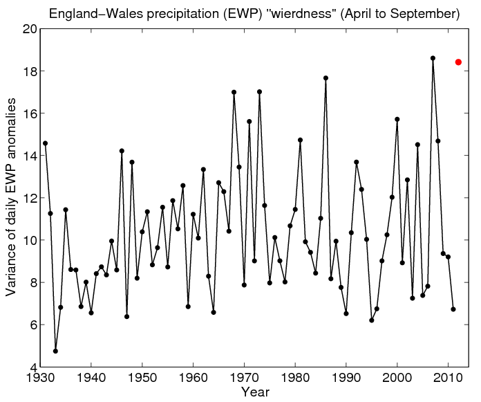
Following the article, I used the England and Wales precipitation (EWP) timeseries (available here), and calculated the daily anomalies by subtracting off a smoothed annual cycle of precipitation. This leaves the ‘weather’, and the variance of these daily anomalies from April to September is one way of objectively defining ‘weird’. But, there may be others.
The figure below shows this index, and demonstrates that 2012 is the second weirdest year in the record (since 1931), just behind 2007. There is a positive trend in the index, which is significant at the 95% level. So, UK rainfall has been very weird this year, and has been getting “weirder”, but 2012 was not the weirdest on record, at least by this definition.
The BBC article refers largely due to the change in river flows, which are also dependent on the temporal distribution of rainfall anomalies, as well as many other factors (weather related and not) which are not captured by this simple analysis.
UPDATE: (from CEH) The original material used for the BBC article is here, which does not use the word “weird”, except in the title bar of the webpage.

Why April – Sept? Is that ‘cherry picking’? I just had a quick look annually and the weirdest year seems to be 1929. Your graph starts in 1931!
Hi Paul – the data I’m using only starts in 1931!
http://www.metoffice.gov.uk/hadobs/hadukp/data/daily/HadEWP_daily_qc.txt
And the reason I chose April to September was that the BBC article highlighted the spring-summer seasons in particular. I looked at Jan-Sept first, and 2007 was still “weirder” than 2012.
cheers,
Ed.
I was looking at the monthly data and just plotting the variance of each row (because I’m lazy and I can do this in a couple of lines in Matlab).
This gives the ranking
1929
1799
1852
2000
Looking at the historical records, 1929 had a drought early in the year then heavy rain and floods later. 1799 was cold and wet. In late 1852, “Thames Valley from Vauxhall to Windsor resembled a ‘vast lake’. Oxford was standing in a ‘sea of water’, the Cherwell and Isis being several miles wide.” And in Nov 2000, my house was flooded!
Using the period Jan-Sep, so that 2012 can be considered, 1799 wins and 2012 comes about 10th.
Hi Paul,
The benefit of using daily data is that the analysis can distinguish between periods of alternating wet and dry which get disguised by a monthly average (e.g. this year where July was wet for 1st half and dry for 2nd half). Also, this analysis is not looking at flooding per se (like many of your historical records), but finding years which have long periods which are unusual (both wet and dry).
BTW – Central England Temperature this year was not unusually “weird”.
cheers,
Ed.
“But scientists present from the Met Office and CEH said not much could be read into the weird weather. Terry Marsh from CEH said: “Rainfall charts show no compelling long-term trend – the annual precipitation table shows lots of variability.”
Variability is not a mistake, or a mystery. It is exactly what one should expect. This seems similar to the ‘cancer clusters’ that are constantly being found. They are found because they should be found – they are an expected result of variation being non-regular. In this case, some years SHOULD be ‘weird,’ and some decades SHOULD show an increase in such ‘weirdness.’ Probability 101.
Hi Mark – I agree! That’s why I looked at the long term trend since 1931, rather than anything shorter term.
Ed.