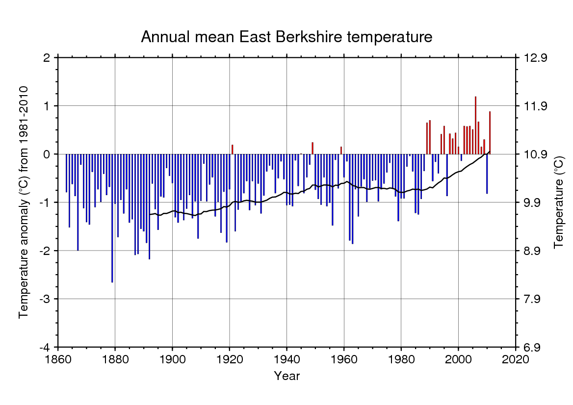
At a recent weather festival, Roger Brugge presented a reconstruction of temperatures from 1863 to 2011 for a small patch of the UK, namely Berkshire, which I found interesting.
Roger has collected a large set of weather observations covering the past 150 years from various sources in East Berkshire, including Met Office weather stations and a set of amateur observations. I was quite surprised to see the strength of the trend in the resulting time series, with a strong warming over the past 30 years or so, and lots of variability. Lots of visitors to the festival felt it helped them understand how the climate may be changing for them and their region and put recent weather into a longer term context.
Update (07/06/12): You can also now see the month by month temperature timeseries.
Update (07/06/12): Two versions of the data are now shown below – the first is from the weather festival and very wide – the second is perhaps more suitable for viewing.


The growing West London commuter belt sounds like a prime site for UHI warming.
Hi Paul,
Am sure some component of the trend is UHI effects, but it of course depends on where the observations are based exactly, which I don’t know.
What is interesting is the running means (shown by the black line) match the global trends rather well. Not sure this year is going to be very warm though!
cheers,
Ed.
Except that global temps saw a mid 20th century warming peak around 1940’s rather than the 1960’s seen in the Berkshire record. And the recent warming seems to have started around 1990 in this record while the global record sees warming to resume in the mid-70’s.
The timing in the ‘phase changes’ in the Berkshire record look like they match better the changes in the NAO index.
http://www.cpc.ncep.noaa.gov/products/precip/CWlink/pna/JFM_season_nao_index.shtml
Hi HR,
For some reason Roger plotted the running mean at the end of each 30 year period, so the mid-20th century warming peaks in the 1940s, just like the global mean.
cheers,
Ed.
Ed, the seasonal and monthly plots don’t seem to match up.
ie 1962 looks a mighty cold winter with DJF about 0 degrees on average.
The individual temps are about D -> +1.7 , J -> +4.5 , F > +.4.8
1963 has a couple of cold months so have the graphs shifted by a year somewhere as randomly checking 1940 doesn’t match either?
Is the difference due to whether the DJF refers to the year of the December or the January?
Roger Brugge maintains the dataset, and will know the answer! r.brugge AT reading.ac.uk
Thanks,
Ed.