Regular readers will be aware of the #endrainbow campaign to reduce the use of rainbow colour palettes in scientific figures. At the recent EGU conference, I gave a talk on ‘making better figures’, which included an example of a published conclusion which was incorrect due to the use of a rainbow colour scheme.
In a paper in 2006, a series of ‘fronts’ were identified in spatial ozone fields (Fig. 1). In the original figure, there is a clear apparent boundary between the yellow and green regions, which was identified as a ‘sub-tropical’ front, and highlighted with a blue line.
How robust is this published finding of a sub-tropical front and associated changes in its behaviour?

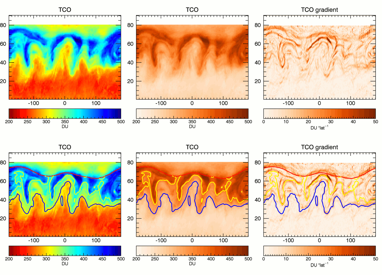
Sean Davis (NOAA) reanalysed the same data of total column ozone (TCO) with a similar rainbow colour scale (Fig. 2, left), and a sequential colour scale (Fig. 2, middle). The same sub-tropical ‘front’ is apparent in rainbow, but far less clear in the sequential scheme.
So, which is right?
The right hand panel shows the latitudinal gradient in the same ozone field. Dark colours indicate large gradients, and hence possible ‘fronts’. The yellow ‘mid-latitude’ front is clear in the gradient field, whereas the blue front is far less clear – it is a mirage, an artefact of the choice of colour scale.

Why is the front so ‘visible’ in rainbow?
It is because rainbow scales are not ‘perceptually uniform’ – they create sharp artificial boundaries between colours (particularly involving yellow) that are not necessarily representative of the underlying data (see another example here).
Relying on a change of colour to define a front is clearly not right in this case. Using a perceptually uniform scale, such as the sequential scheme shown here or others, would have avoided this erroneous conclusion.
Summary: use rainbow colour schemes with caution, or avoid them if possible!
More information: my EGU talk is available, or see Doug McNeall’s longer version or discussion on colour scale choice.
Thanks to Sean Davis for letting me use his graphics.
Thanks for this, changing my colour scales right away! Trouble is that it can be fine on so many occassions that analyst becomes complacent.
Thanks Helen – great that you’re changing colour scales. Please tell your colleagues!
cheers,
Ed.
I’m all for #endrainbow, but I think this finding needs a bit more explanation to strengthen it. It’s unclear to me, at least, that the image was the driving force in the conclusions.
Going back to the original 2003 paper (Part 1), it sounds like (to the lay reader) the regions were already defined by Karol87 using other means (jet stream positions?) and the new paper aligns those boundaries with TOMS data contours, which happen to correspond to hue transitions (by chance or by design). For instance, the following suggests the coloring is only following the boundary rather than defining it:
However, it’s unclear what they mean here by “using a contour program”:
Is that where we should read “using the bands from a rainbow heat map”?
If you could help connect the dots, it would be helpful to those of not in the field and not having access to all the papers and data.
Btw, is the data from the plot publicly available?
You are correct — it is a specific threshold value of Total Column Ozone (TCO, units DU) that defines the boundary, not a color.
Also — to answer your question about contouring — The original authors used a “contour program” to extract the (latitudinal) boundary along a specific threshold of DU.
The point of this example is that the subtropical front boundary (the blue line), which is nominally related to a sharp gradient in TCO, is not nearly as clear in the data as suggested by the use of a rainbow color scale. There is a gradient in TCO going from the tropics to the extra-tropics, but the gradient is not nearly as sharp as implied from the original figure.
It’s easy to normalize the rainbow colormap to smooth out the sharp artificial boundaries. Just divide the red, green, and blue values by their norm, sqrt(red^2+green^2+blue^2). The primary colors – red, green, and blue – stay equal to 1, but the cyan and yellow get divided by sqrt(2) so all colors become equally bright.
That still doesn’t fix the colorblind issue, but otherwise the normalized rainbow works just fine in many applications.