In my recent post whether there is a ‘hiatus’ in global warming I left out the satellite observations of the lower troposphere. The reason for that was that the analysis of these is different from that of the near-surface series, and I considered the latter were more relevant. First, most of us live at ground level most of the time, and secondly this has traditionally been the main measure by which to gauge global warming. My conclusions were that there has been a positive trend since 1998, but no trend over the last 10 years. However, the natural variability of 10-year trends is so large that this is compatible with the positive long-term trend. The indicator of global warming with the best signal-to-noise ratio, ocean heat content, shows no sign of stopping over the last 10 years.
Guest post by Geert Jan van Oldenborgh, KNMI
In this post I consider whether the same holds for the temperature of the lower troposphere (TLT) that is measured by satellites. This is an estimate of the temperature over the lowest ten kilometres of the atmosphere, with a weighing function that emphasises the 0-4km layer. The analysis below contains nothing new, the ideas have been around for more than ten years and have been published by various people (e.g., Foster and Rahmstorf, ERL, 2011). Most of the content and links to other articles can already be found in the comments on the post on the near-surface temperature.
The annual mean time series is shown in Fig. 1. It starts at the beginning of the modern satellite era, in 1979. This is in stark contrast to the global mean near-surface temperature that can be reasonably accurately reconstructed to the end of the 19th century. The short record is one of the reasons it is not used much in climate science.
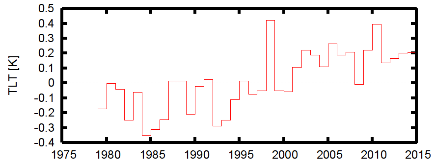
The global mean TLT differs from the global mean near-surface temperature in a few key aspects. One of them is that the influence of El Niño is much larger, as can be seen from, e.g., the height of the peak in 1998, which is about 0.4 K above the trend line, against about 0.2 K in the near-surface temperature. Note that strongest effects of El Niño on temperature lag the event itself by about half a year. The 2010 peak is also higher, about 0.2 K versus only 0.1 K. On a map, this can be seen as a stronger and broader response to El Niño and La Niña in the tropics, see Fig. 2. The amplification can easily be understood due to the stronger warming at height caused by the heat of condensation of the higher rainfall. This is the upper tropospheric warming that accompanies an increase in SST in the tropics. In the deep tropics, near the equator, this causes heating well above the lower troposphere and hence is not clearly visible in the TLT, but away from the equator the warmer air descends in the Hadley circulation and enters the heights to which the TLT is more sensitive.
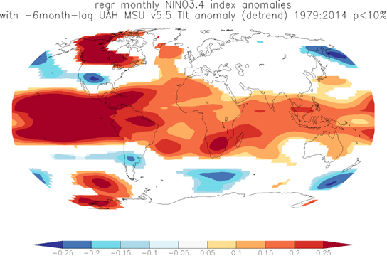
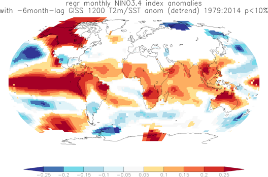 Figure 2: (top) Regression of TLT on the Niño3.4 index as a measure of the strength of El Niño with a lag of 6 months. (bottom) The same for the SST/T2m field over the same time period. All data have been detrended first. Source: TLT: University of Alabama at Huntsville, SST/T2m: NASA/GISS.
Because the effects of El Niño are stronger in the TLT than in the near-surface temperature, the year 1998, following the strongest El Niño on record, is indeed still the warmest year in the series. Trends starting on this exceptional year naturally are lower than the long-term trend, but not zero at 0.05 K/decade. The trend from 1999 would be equally zero if global warming would have stopped in 1998, but it is 0.12 K/decade. Both are within the uncertainties equal to the long-term trend of 0.13 K/decade.
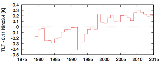
The trend is better visible if we subtract the effects of El Niño, as many people have shown already. Subtracting 0.11 times the Niño3.4 index lagged by the same half year I obtain the series shown in Fig. 3. The El Niño of 1998 has been much suppressed, but is still visible, so the subtraction factor (determined by linear regression) is a bit too small for the biggest events. The biggest signal now is the cooling due to the eruption of Mount Pinatubo visible in 1992 and 1993. Also visible is the cooling due to El Chichon after it erupted in 1982. Apart from that this series shows a steady increase with natural variability around it, with no pause in heating. Only short trends up to 2014 are negative, starting with the 6-yr trend 2009-2014. These short trends have uncertainty margins that make them compatible with the long-term trend.
Another difference between the TLT and near-surface temperature occurs in the subtropics in the areas near the eastern coasts of ocean, where very low clouds form over the cold waters. In these areas the surface temperature is decoupled from the temperature of the air above it by these clouds. These areas are visible as white regions in the plot of the regression of TLT on near-surface temperature, Figure 4.
A third large difference between near-surface air temperature and the TLT occurs in the high latitudes. Cold air in winter there is often a thin layer on the ground, an inversion. Under these circumstances the thermometers at 1.5m height and the satellite that averages over a large part of the atmosphere naturally give quite different numbers. The variations near the ground are then also much larger than the variations higher up in the atmosphere. This is visible in the annual mean as the lighter areas over the high latitudes in Figure 4, especially Siberia. This effect implies that the Arctic amplification, the stronger trend in temperature in high latitudes, is not as strong in the TLT as it is in near-surface observations. Most of the warming there has been in winter and very low in the atmosphere.
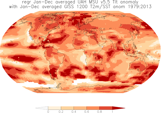
In the global mean trend difference between the ground and the lower troposphere, the effects of the upper tropospheric warming and the vertical structure of the Arctic amplification cancel to a large extent, so that the final series look similar, but this hides the differences in the (sub)tropics and high latitudes.
I conclude that beyond the effects of El Niño there is no pause in the warming in TLT either. As there is no evidence for a long-term trend in the Niño3.4 index, this means it will revert to normal before long and by that time the trend will pick up in the full TLT series as well. I think that may well be next year (2015), due to the (very small) El Niño this winter, but that may be overwhelmed by other natural variability. The TLT series looks so similar to the near-surface temperature series only because of a cancellation between the differences in the tropics and the high latitudes. However, neither shows that global warming stopped.
You “conclude” that there is no pause? Based on what? Your own assertion? Anyone can look at the graphs and see the pause.
Let’s look at what the guy who produces the data says:
“We all know that global warming has been on hiatus – set on pause – however you like to characterize the lack of significant warming, for over 15 years. Depending on how you do the statistics, the vast majority of the climate models used to guide our energy policy have over-predicted the surface warming trend since the satellite record began way back in 1979.”
Sure there is a lower trend over the last 15 years. Not zero, but it is a matter of semantics whether you call it a pause or not. However, I show this is for a large part due to starting on the strongest El Niño in the record and ending on a few La Niña years. The fact that it is a lower trend has therefore nothing to do with a pause in global warming: the underlying trend continues, this is a fluctuation around that trend. If global warming would have stopped, a trend starting in 1999 would also be small or zero. It is not.
So, due to the larger influence of El Niño on the TLT it requires the extra step of subtracting the effects of El Niño to see that the long-term trend continues (Figure 3). Or do you want to argue that the trend from El Niño in 1998 towards La Niña over the last few years will continue into the future?
Nice post, thanks Dr. van Oldenborgh.
Of course, the “guy who produced the data” Roy Spencer certainly is a master of the cherry-pick, as well as polynomal curve-fitting.
To save others a Google, here’s the link to PM’s source.
[Lightly edited for tone – Ed]
If you also take into account the changes in recent (volcanic) aerosols and solar activity there is very little to no evidence suggesting a (much) lower climate sensitivity than used in the recent climate models. See for example http://tamino.wordpress.com/2011/12/06/the-real-global-warming-signal/
Another discrepancy I suspect with earlier model attempts is that they use a too large methane forcing because they assumed too high methane growth rate during the 2000s?
Geert, in your figure 2 you show the physical influence of ENSO to UAH (top panel). One can clearly see that it’s almost limited to the tropics. Anyway, in your calculation you make linear regression to the globals with factor 0.11 *Nino 3,4 with a timelag of 6 month. I tried another operation: I divided the latitudes in 3 bands: -90…-19; -19…19; 19…90 and made the “ENSO-clearing” only in the tropics ( where the influence is overwhelming) with best timelag of 3 month with R²=0.52 and a factor of 0,23*Nino 3,4. Wouldn’t it be the better ( more physical) way?
In principle yes. However, the analysis is completely linear so it does not make any difference.
Thanks Geert Jan,
Above you said, “it is a matter of semantics whether you call it a pause or not”.
This is the entire crux of the matter. The way you approach the problem, the methods you use: they define the pause. If someone else approaches the problem differently, they might come to other conclusions because they’ll be using a different definition. To say, categorically, that there is no pause is wrong. The statement is conditional on the methods you use.
For example, when you subtract off the effects of El Nino and La Nina from the TLT global temperatures, you are making a very different thing. It is not global temperature any more.
John
Indeed, there are a lot of semantics involved. First, please do not confuse the near-surface global mean temperature with the globale mean temperature of the lower troposphere. They are different quantities.
Secondly, it all depends what the question was. The question I address is “is there evidence that the underlying trend due to global warming has stopped?”. There are several ways to answer this. The easiest is to look whether the observed fluctuation is compatible with the natural variability around the trend. This turns out to be the case. In a short, noisy record like the TLT series, one has to use knowledge of part of the noise to subtract it, thereby improving the signal-to-noise ratio of the underlying trend. This gives the same answer: there is no evidence that the underlying trend has stopped. As many people have shown.
If you choose to define hiatus / pause as simply a period of time in which the global mean temperature has not risen, without drawing any conclusions about the underlying trend or implications about the future, you are completely correct.
Thanks Geert Jan,
I try not to confuse temperatures through the lower troposphere with temperatures at the surface. I have also been moved, from time to time, to point out, as you have, the distinction between air temperatures just above the surface of the ocean and water temperatures just below it. In a similar vein, I try not to confuse temperatures at the surface with the heat content change diagnosed over some depth of the ocean. These are all, as you rightly say, different quantities. If our aim is to explain recent changes in the climate, then a good explanation should cover the various movements of all these measures. Where your explanation is most interesting (to me) is when you talk about the physical differences between these measures.
Where you lose me is where you start talking about “underlying trends”. What we have to start with here is a series (or several, all uncertain) of global mean temperature. It is not conveniently partitioned into “underlying trend” and “natural variability”. Consequently, it is not possible to speak of “the” trend without also specifying very clearly what that means. You need to say what (poissibly simplified, possibly statistical) model you are using to represent the data. Above, you talk about subtracting 0.11 times the Nino 3.4 lagged by 6 months. That’s clearly part of your model, but not the whole thing – what sort of trend do you use, what’s your model for the residual variability – and might lead us to ask “why Nino3.4 instead of SOI, why 0.11 instead of 0.13, why 6 months and not 4 etc?”
You say that you are addressing the question, “is there evidence that the underlying trend due to global warming has stopped?” but I don’t think that you are. The question as posed is more along the lines of “are the data still consistent with my statistical model?” which is quite a different thing. In order to address the question “is there evidence that the underlying trend due to global warming has stopped” I would argue that first you actually need a statistical model which allows for the possibility that global warming has stopped and second some means of comparing this model with others.
Best regards,
John
Thanks for the article. It brings home the effects of natural variability noise on the TLT record, and on the surface record noise.
I know I have mentioned it before, but I still do not know who invented the term “pause” perhaps it just popped into usage. The IPCC AR5 reports use the term “hiatus” not pause, there is a difference between the terms.
I am OK with the analysis pulling out the ENSO variability, the objective of the analysis is to determine the trend in global temperature due to greenhouse gases, not a reconstruction of the actual temperature. The way I look at it is the trend is hidden by natural variability, ENSO is a well defined source of natural variability so it can be removed for the sake of the analysis.
What exactly does ‘natural variability’ mean in climate models?
Is it simply due to a random number generation algorithm – for example the probability of a volcanic eruption in the future or the probability each year for an El Niño ?
Are possible multi-decadel oscillations like AMO/PDO excluded?
Thanks
Hi Clive,
There are no random number generators inside the GCMs. But, they do spontaneously generate ENSO events and NAO-like, AMO-like and PDO-like variability also because these are manifestations of the physics of the climate, which is represented inside the GCMs. This variability occurs at different times in each simulation because of the chaotic nature of weather.
Volcanoes are prescribed to occur at the right times for the historical period, but none are typically scheduled for the future as we don’t know when they might occur.
Cheers,
Ed.
Ed,
If they ‘spontaneously’ generate ENSO events then they must behave stochastically, which to me is the same thing as rolling a dice. There is nothing wrong with monte-carlo simulations if you know what the probability distribution is.
So when we hear that natural variability can explain the recent hiatus in warming, then to me it just means that the some model runs can reproduce a period of 17 years of essentially zero warming through a run of low scoring dice throws. Is that not essentially correct ?
In other words ~80% of the models projected warmer temperatures (high scores) while ~20% still remain compatible with measurements (low scores).
Maybe models cannot simulate individual future volcanic eruptions but surely they must ‘assume’ some future level of volcanic aerosols. Otherwise all the models would run too hot since we know that 20th century volcanic eruptions produced significant periods of cooling.
I would go so far as to say that climate models are intrinsically uncertain because of the unknowability of future volcanoes. In the long term the best one can do is to assume a time distribution of volcanic eruptions similar to the last 100 years. However any short term predictions covering 30 years or so will always remain uncertain.
Hi Clive,
Yes, you are right – natural variability is sort of like dice rolls, except that it can have long timescales. So a negative PDO state, for example, may last a decade or more, which is sort of a single roll of the dice because it is naturally persistent. The reason we have multiple simulations with some GCMs is to try and sample the possible states (dice rolls) of the PDO (& other modes of variability).
As for volcanoes, my understanding is that there is effectively zero volcanic aerosol after 2005 in the CMIP5 simulations, although some groups may have a low constant background level for the future, rather than zero. Also, some groups are doing additional simulations to test the effect of the small post-2005 eruptions.
The IPCC essentially takes the approach of looking at future climate effects without eruptions, but quantifying what effect a future eruption would have, if it were to occur. So, yes, in some sense the GCMs might be too warm but the large eruptions which produce a temporary cooling are unpredictable – e.g. there are long historical periods (e.g. 1913-1962) with very low volcanic activity. And, we don’t know what size an eruption might be.
cheers,
Ed.
“First, most of us live at ground level most of the time, and secondly this has traditionally been the main measure by which to gauge global warming.”
That is a hugely important point. In terms of modelling the behaviour of the Earth system “as a whole ” it shouldn’t matter whether we , the modellers, live in the jet stream or the bottom of the Mariana Trench. Physics is physics wherever we choose to “slice and dice” the planet, are we being a tad “anthropocentric” in our choice of metrics?
The temperaure anomaly measurements are averaged over all ground stations. However some stations are roughly at sea level and others are up to 6000 m above sea level. Some places are rising and some are sinking with tectonic plates and fault lines. This must all have changed slightly since 1850 in addition to the movement of weather stations.
Satellite data does at least have the advantage of being a single layer.
Geert; my previous comment was not “disingenuous” just aimed at highlighting where we, as a terrestrial species, choose our benchmarks for identifying the “warming”.
Looking at Fig 3 with El nino subtracted, the step change in TLT rather coincides with a flip to the current warm phase of the AMO. One of the early papers from Berkeley Earth seems pertinent;
http://static.berkeleyearth.org/pdf/berkeley-earth-decadal-variations.pdf
“Given that the 2-15 year variations in world temperature are so closely linked to the
AMO raises (or re-raises) an important ancillary issue: to what extent does the 65-70
year cycle in AMO contribute to the global average temperature change? (Enfield,
2006; Zhang et al., 2007; Kerr, 1984.) Since 1975, the AMO has shown a gradual but
steady rise from -0.35 C to +0.2 C (see Figure 2), a change of 0.55 C. During this same
time, the land-average temperature has increased about 0.8 C. Such changes may be
independent responses to a common forcing (e.g. greenhouse gases); however, it is
also possible that some of the land warming is a direct response to changes in the
AMO region. If the long-term AMO changes have been driven by greenhouse gases
then the AMO region may serve as a positive feedback that amplifies the effect of
greenhouse gas forcing over land. On the other hand, some of the long-term change in
the AMO could be driven by natural variability, e.g. fluctuations in thermohaline
flow. In that case the human component of global warming may be somewhat
overestimated”
I completely agree that global warming has not stopped, the long trend is upwards. The satellite data and TLT is a recent brief snapshot relative to the old instrumental record. In the next 5 or so years our satellite data should reflect(if the AMO holds) the next step change to a cold AMO. Whatever that proves to be will at least be useful as a first step in quantifying “internal variability” against other forcing of the Earth climate system.
Thanks for an interesting post.
Cheers
Stephen